Visual Identity for
Company ArtCat
Making visual identity for VR digital cultural communication company ArtCat
Challenge
ArtCat, a digital cultural communication company focused on making VR education accessible to everyone, needed a logo to launch their brand. Although they are a tech company, they wanted a design that felt less technical and more elegant.
Since the company was just starting out, the first step was to align the three founders on the key elements that would represent the brand.
Goal

Brand workshop
Organised a brand workshop to help define the vision for the brand and determine how it should look and feel.

Visual Identity
Created a concise visual identity to help the company establish a strong foundation as it launched.
Responsibilities
- Create Brand workshop
- Design Visual identity
Design tool

Brand workshop
To better understand their vision, I organized a brand workshop. Before the workshop, I asked the three founders to fill out a worksheet, encouraging them to explore inspirations and identify other brands they admired.
During the workshop, we focused on:
- Brand personality
- Visual inspiration
I used the insights and discussions from the workshop to guide the design of three distinct brand directions for them.
Designed three versions
I created three logo versions, each with its own colour scheme and typography, based on the ideas and insights established during the workshop.
Each brand direction was shaped by the key words identified in the workshop:
- Feminine, approachable, and elegant
- Simple, established, and elegant
- Playful, approachable & friendly
The final version
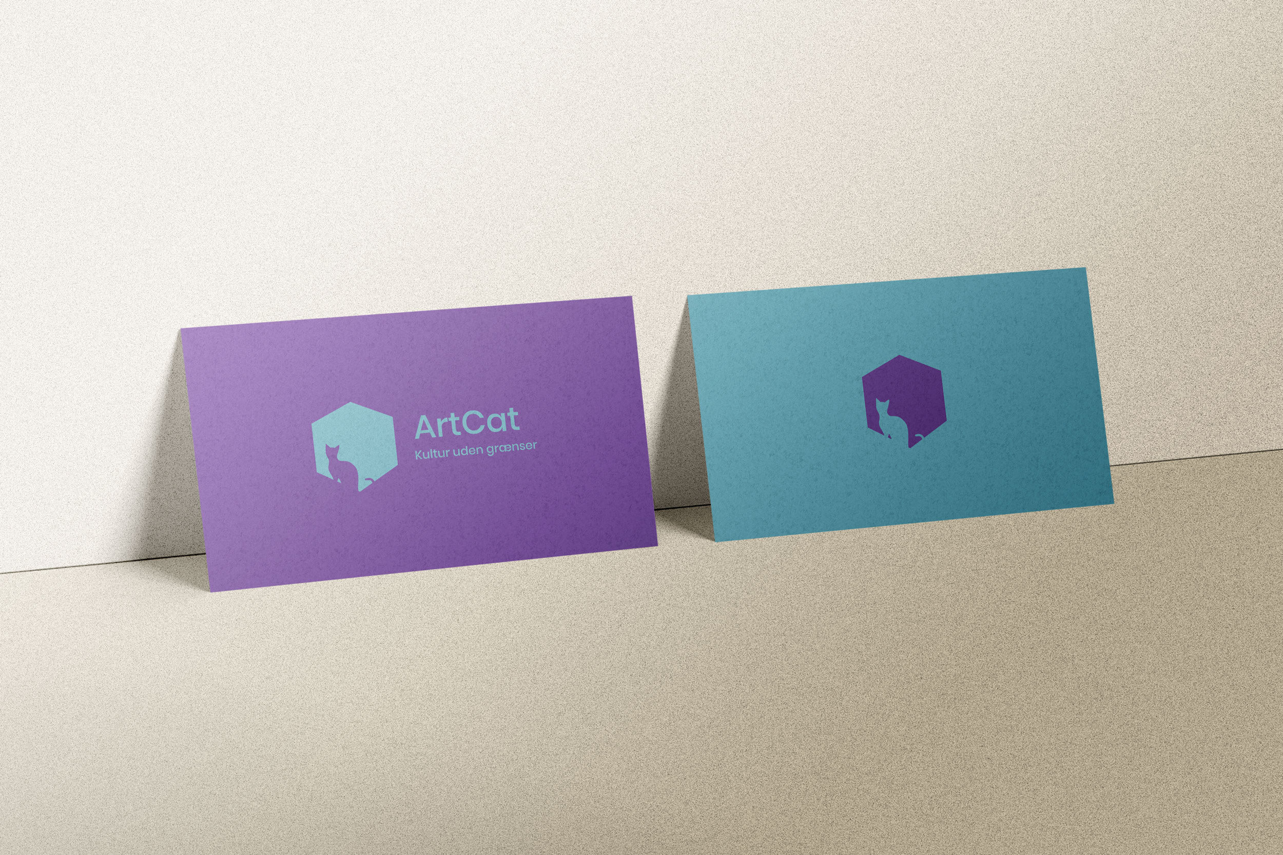
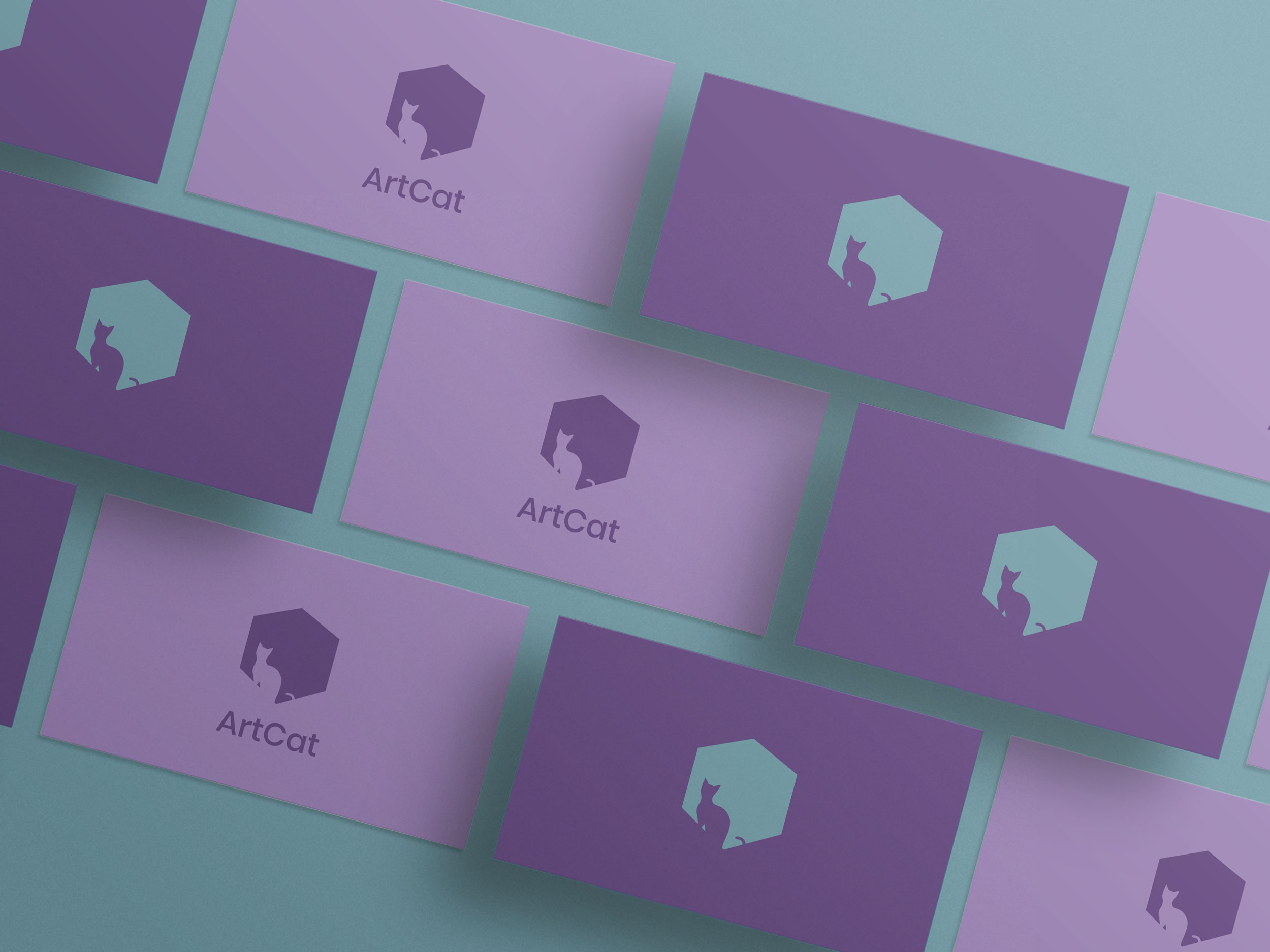
In the final version, I designed multiple logo variations to ensure compatibility across all platforms, as well as colour schemes and typography.
Logo versions
Designed to be adaptable for various platforms.

Typography
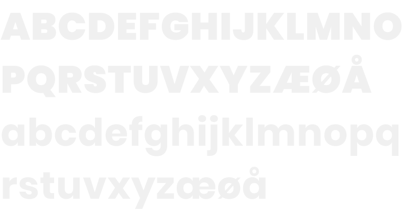
As typography I chose Poppins, a feminine and elegant sans-serif font with rounded shapes to match the brand values.
Colours
Soft purples to give a feminine and elegant feel, paired with a dusty blue.


Key learnings and outcome
- The workshop helped find the company’s personality and visual style, giving everyone a solid starting point.
- The visual identity gave the company a professional appearance that connected with their audience.


