Compiling the three different brands of Hedia, making a book with defined rules on how to use the different elements.
Challenge
The Hedia team had a lot of confusion around how to use the three brands: Hedia, Hedia Diabetes Assistant, and Hedia Education. They struggled to find the correct logos, were unsure how to apply the colours, and lacked a single source of truth for accessing all necessary resources.
Goal
Bring all designs together into one brand book with clear usage rules.
My responsibilities
- Organised and unified various designs into a brand book
- Created clear usage guidelines for all designs
- Ensured consistency across the different brands
Design toolkits

Result
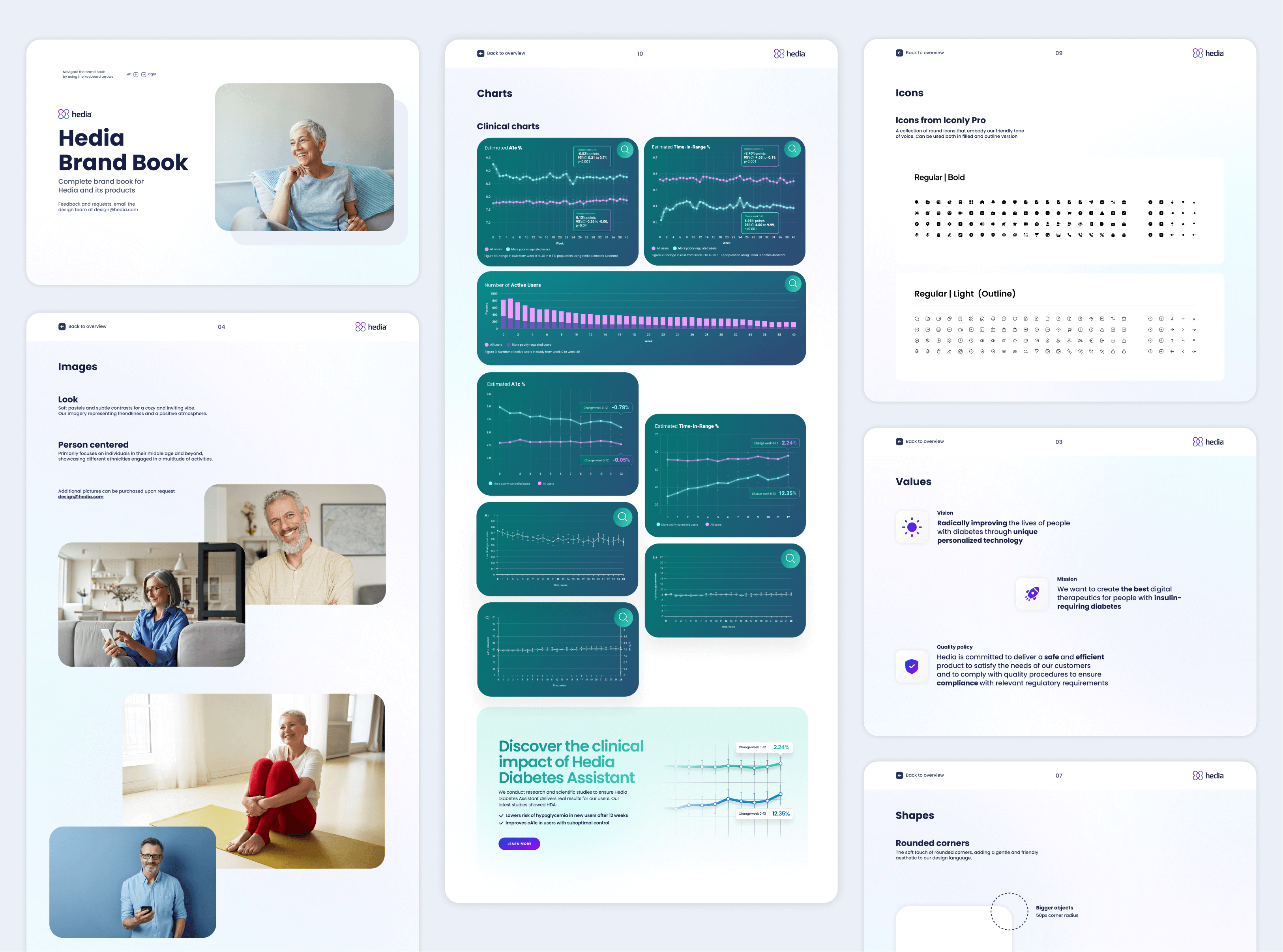
Hedia
Look and Feel
Soft pastels and subtle contrasts for a cozy and inviting feel. Imagery representing friendliness and a positive atmosphere.
Voice and Messaging
Friendly, supportive, and people-focused.


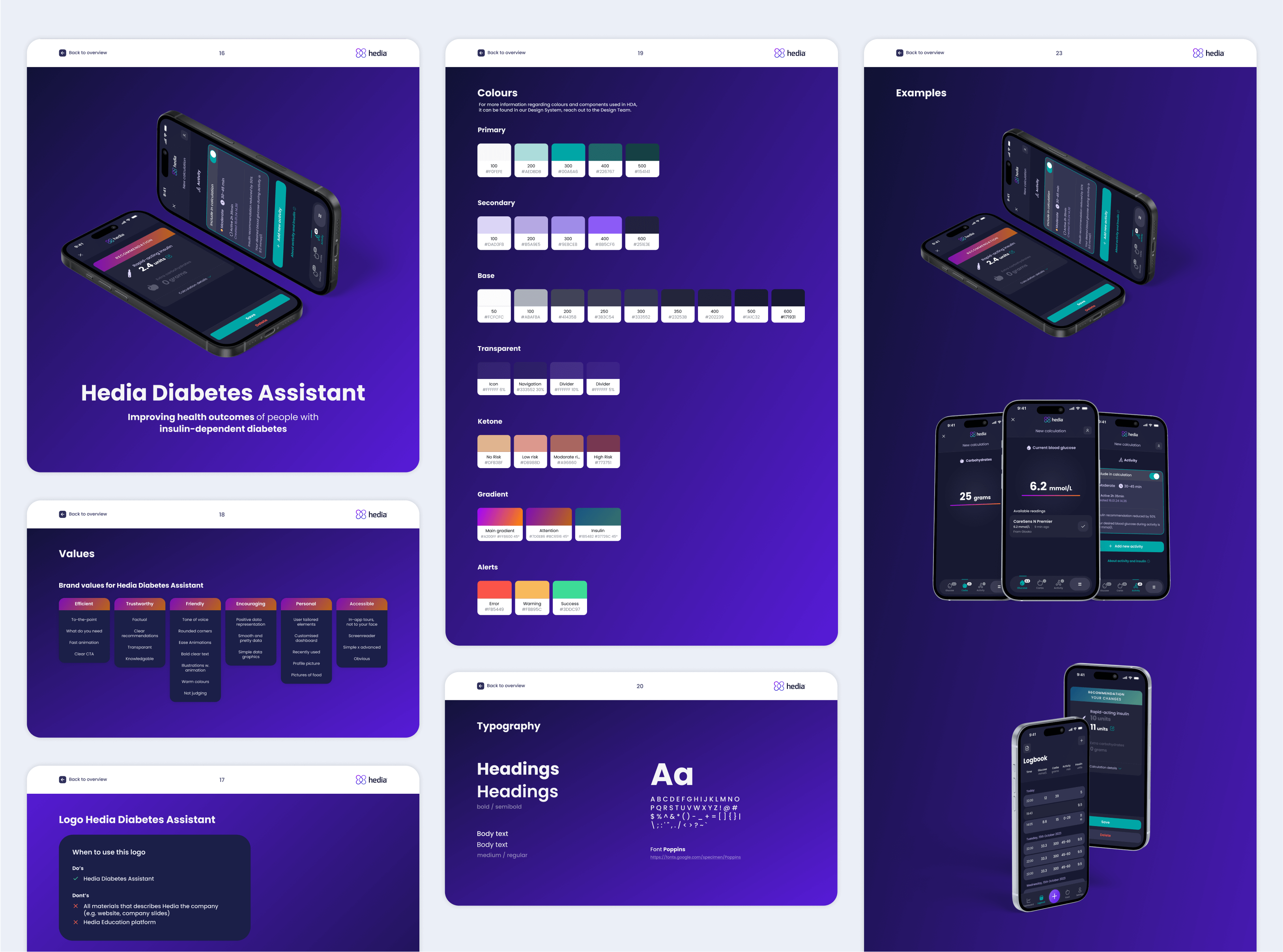
Hedia Diabetes Assistant
Look and Feel
Dark mode with deep blues and greys for a modern look.
Voice and Messaging
Friendly, Trustworthy, Efficient and Encouraging
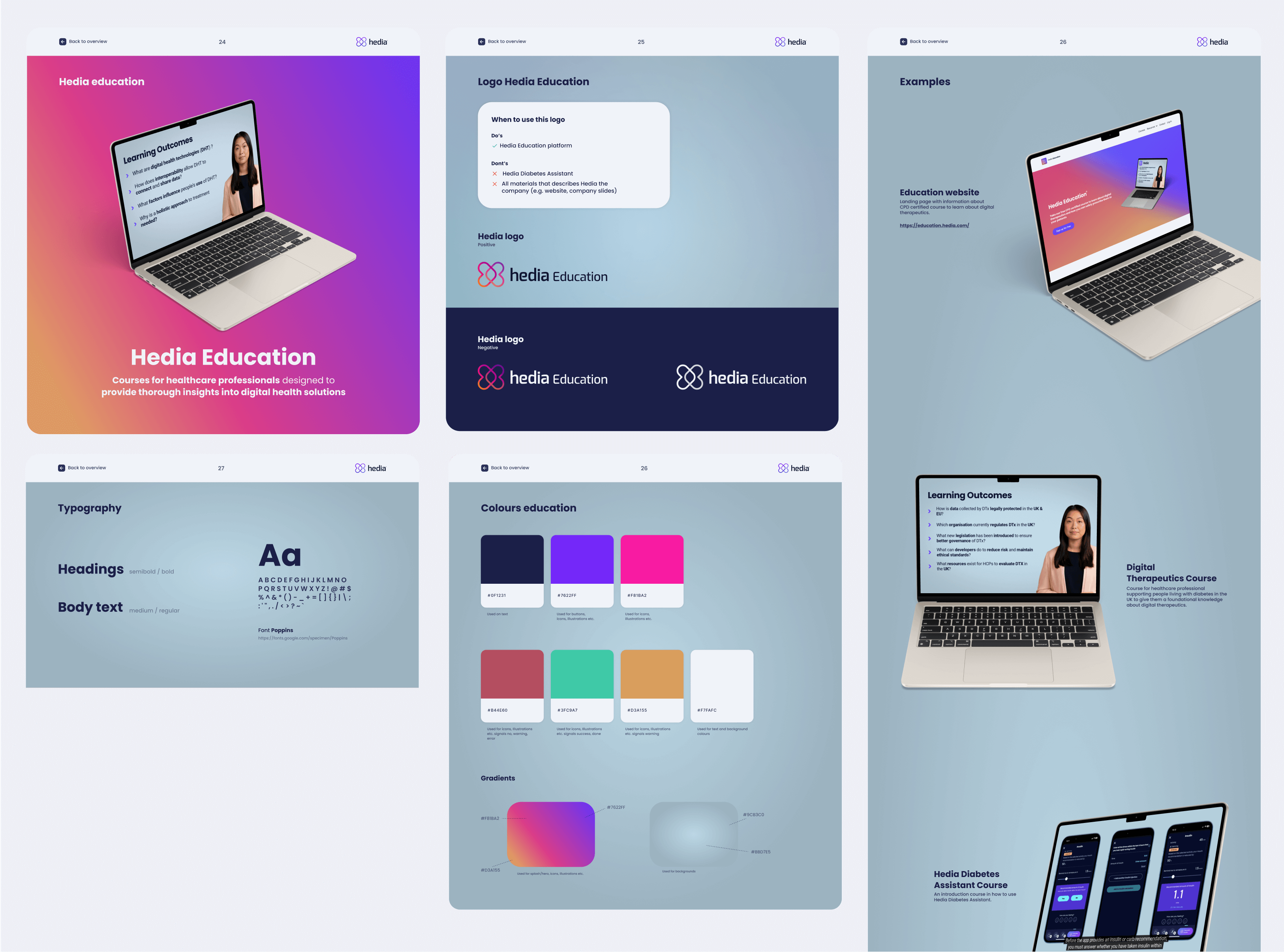
Hedia Education Universe
Look and Feel
Bright, playful colours to inspire and engage.
Voice and Messaging
Fun, enthusiastic, and motivational. We focus on making learning enjoyable and accessible.

My responsibilities
- Created a clear brand book with guidelines for using logos, colors and design elements
- Gathered all resources into one place for easy access
- Improved consistency across the three brands
- Reduced confusion within the team about brand usage