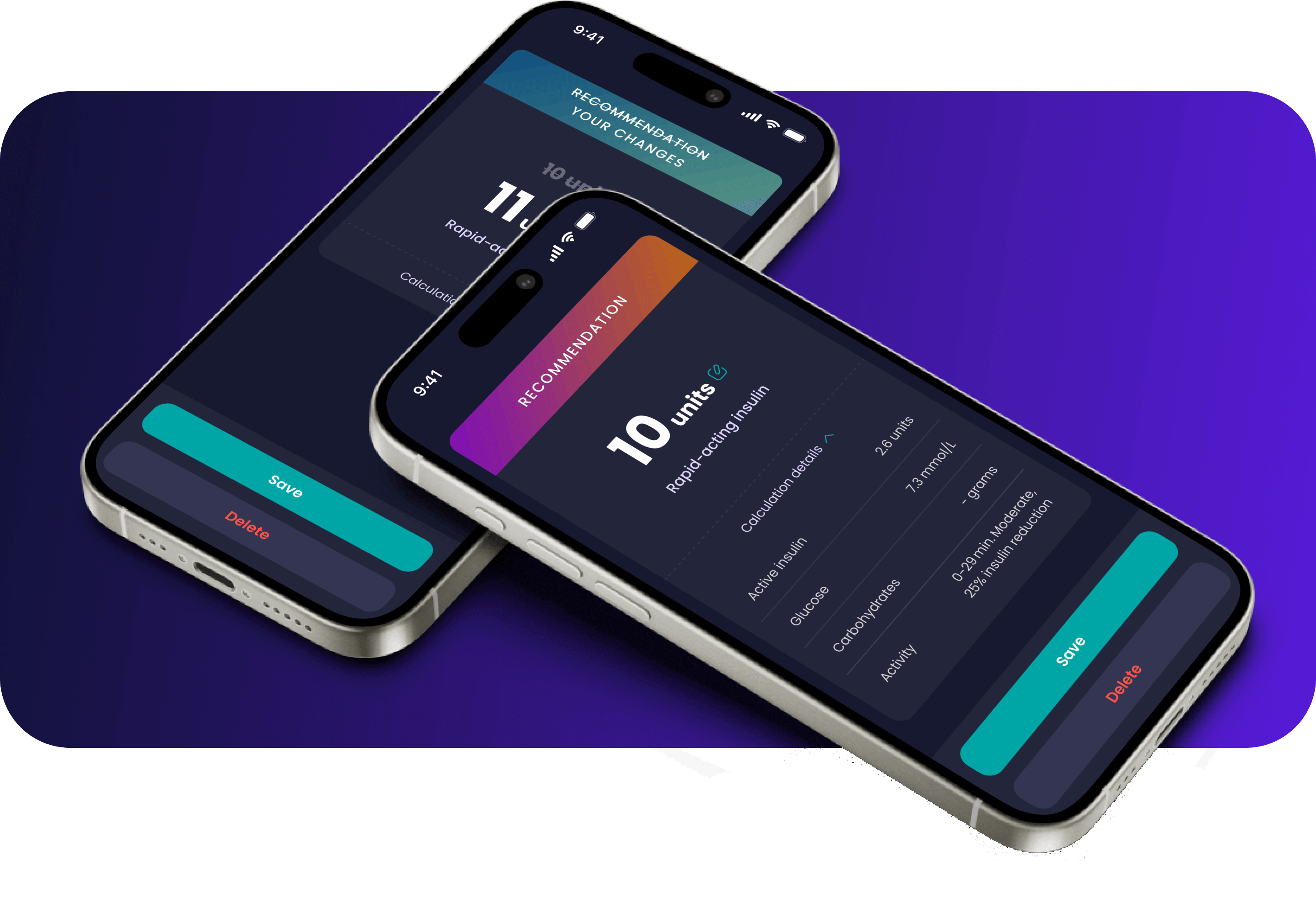
Redesigning and Optimising 'Hedia Diabetes Assistant'
The process of making the class IIb medical device 'Hedia Diabetes Assistant' more intuitive and user-friendly
Challenge
When speaking with users, they often describe the 'Hedia Diabetes Assistant' as complicated and confusing. From a business perspective, the app is expensive to maintain due to the extensive testing required before each release. Since it provides medical advice, testing is necessary to ensure users cannot make mistakes that might harm themselves.
In this project, we focused on making the app easier to use, visually more intuitive, and reducing unnecessary flows. This not only minimizes the chances of user errors, improving safety, but also helps lower Hedia's maintenance costs.
Goals

Reorder, reduce and simplify flows in the app
Ensure it is easy to navigate and understand. Revise and adjust any flows that are unclear or illogical.

Redesign the app's UI
Make it appear simpler and more approachable, moving away from a serious and complicated look.
My responsibilities
- Gather user insights on UserBit
- User interviews
- Mapping out flows in the app
- Participate in branding workshops
- Created main visual direction for the app
- UI-design
Design toolkits

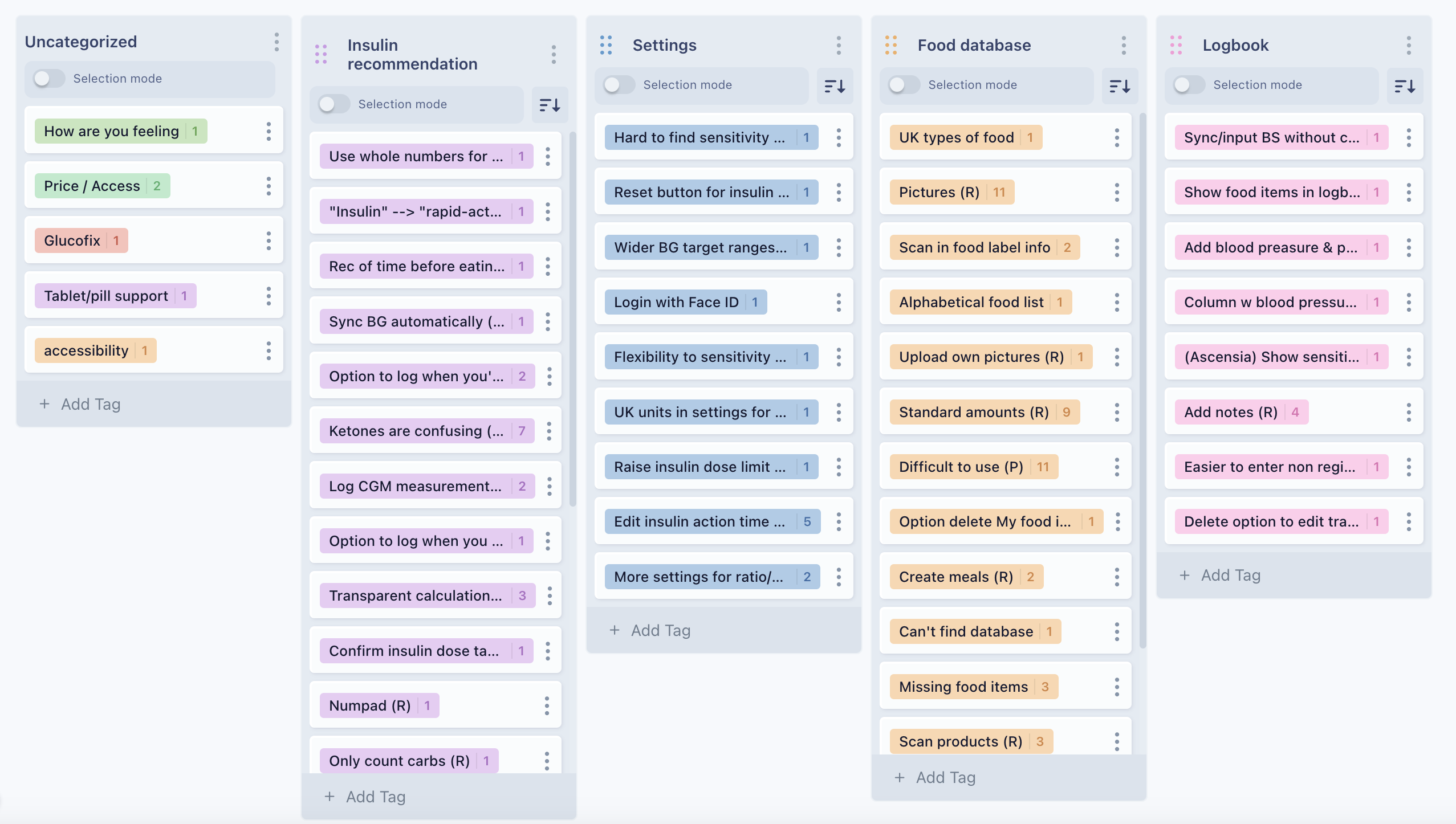
Gather user insights
Conducted user interviews in collaboration with the product manager and gathered user insights for further analysis using Userbit.
Key learnings:
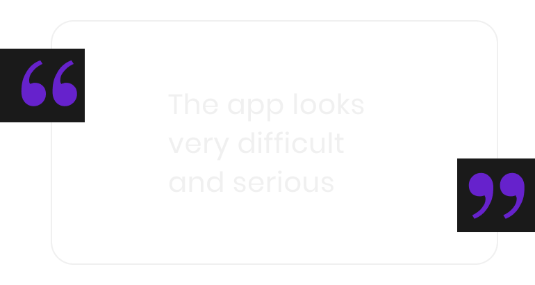
- The app seems very serious and complicated to the user
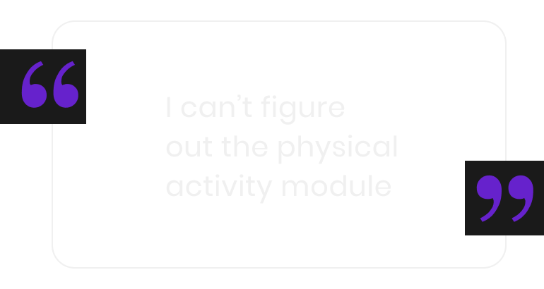
- Several of the flows are confusing
- There are medical terms that the user doesn’t understand
Reducing, cleaning up and simplifying flows
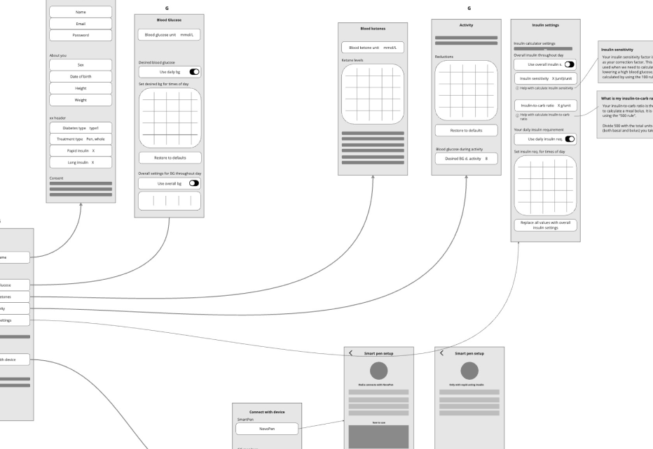
Mapped out flows from the app and simplified them
- Ensured it is clear and logical to find what users are looking for
- Removed duplicated sections
- Aligned all flows related to connecting a Glucose Monitor or SmartPen
Reducing dialogs
The app’s dialogs were overused and inconsistent, leading to user frustration and higher testing costs during releases.
To resolve this, I conducted a review and categorization of all dialogs and user messages. Rather than using dialogs for every interaction, I restructured them into specific categories: Pickers, Error Messages, and Dialogs.
This approach not only improved the user experience but also helped reduce testing costs.
Replace with pickers
Prevent users from selecting incorrect values
Add error text under input fields
Provide clear feedback directly at the point of error
Retain as dialogs
Keep only those that require a full stop for the user
Rebranding of the app
After simplifying many flows, the rest of the design team and I shifted our focus to refining the overall look, aiming for a look that feels simpler and less serious.
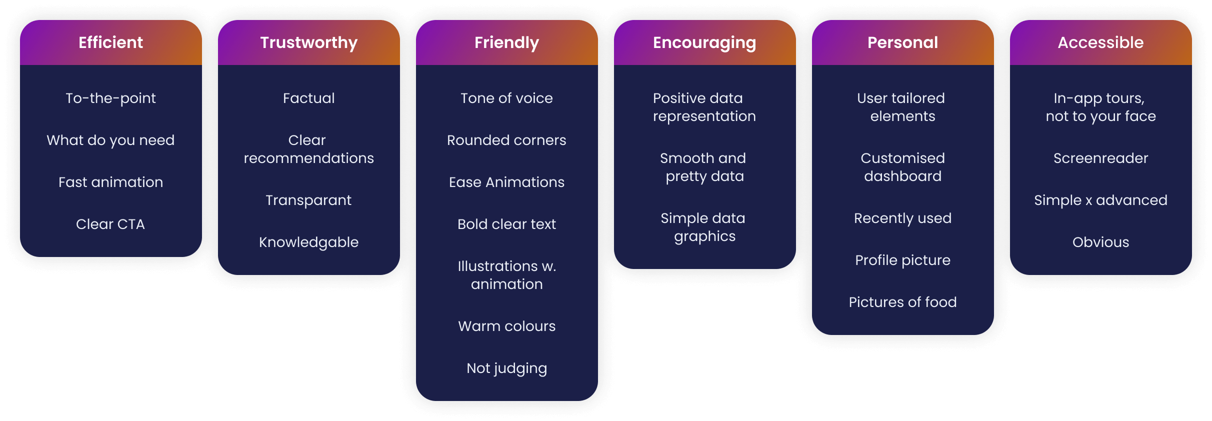
During our design workshop, we identified:
- Brand values
- Brand personality
- Mood board and visual inspiration
Brightening Up the App with Playful Gradients
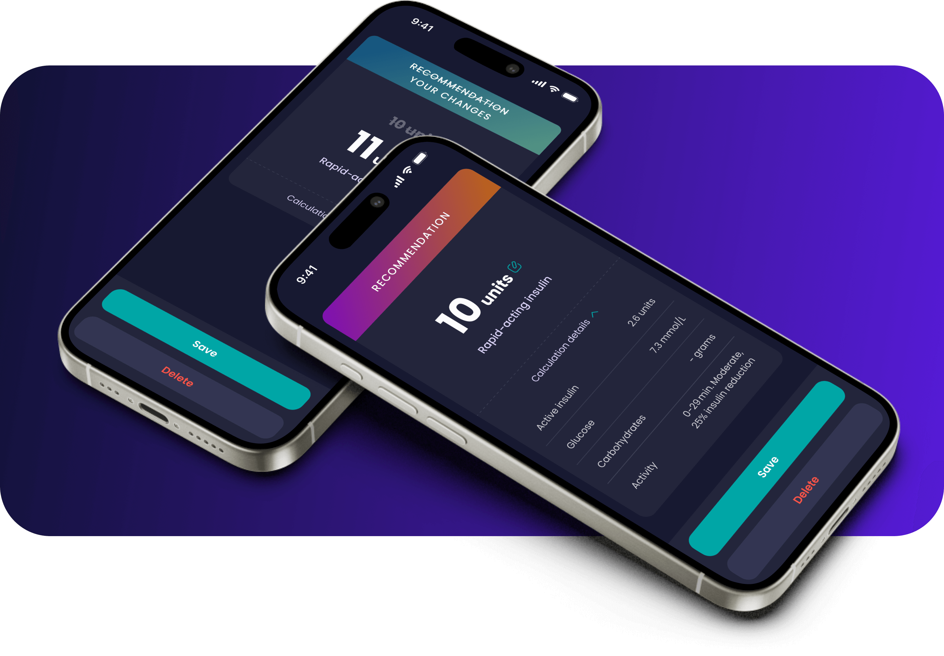
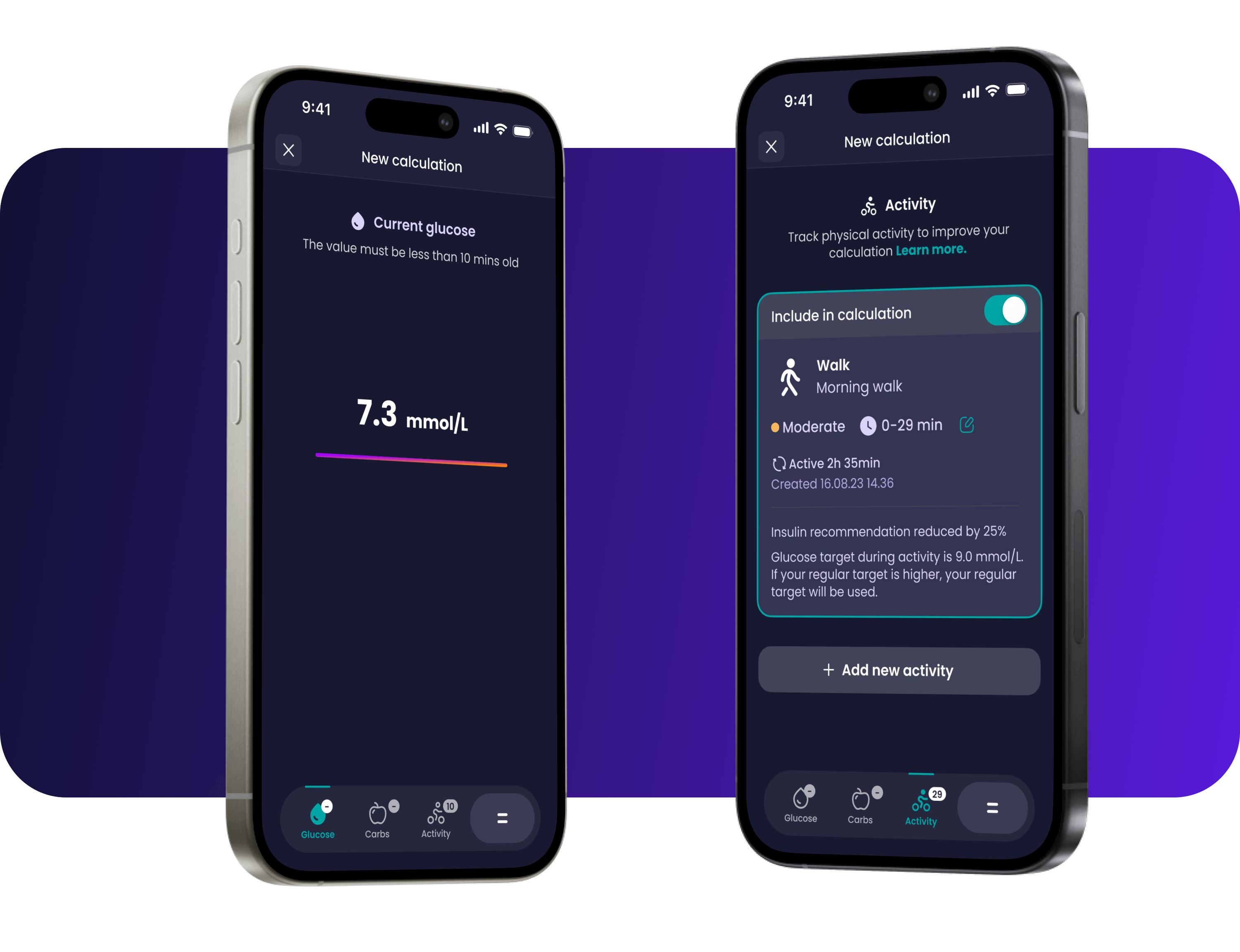
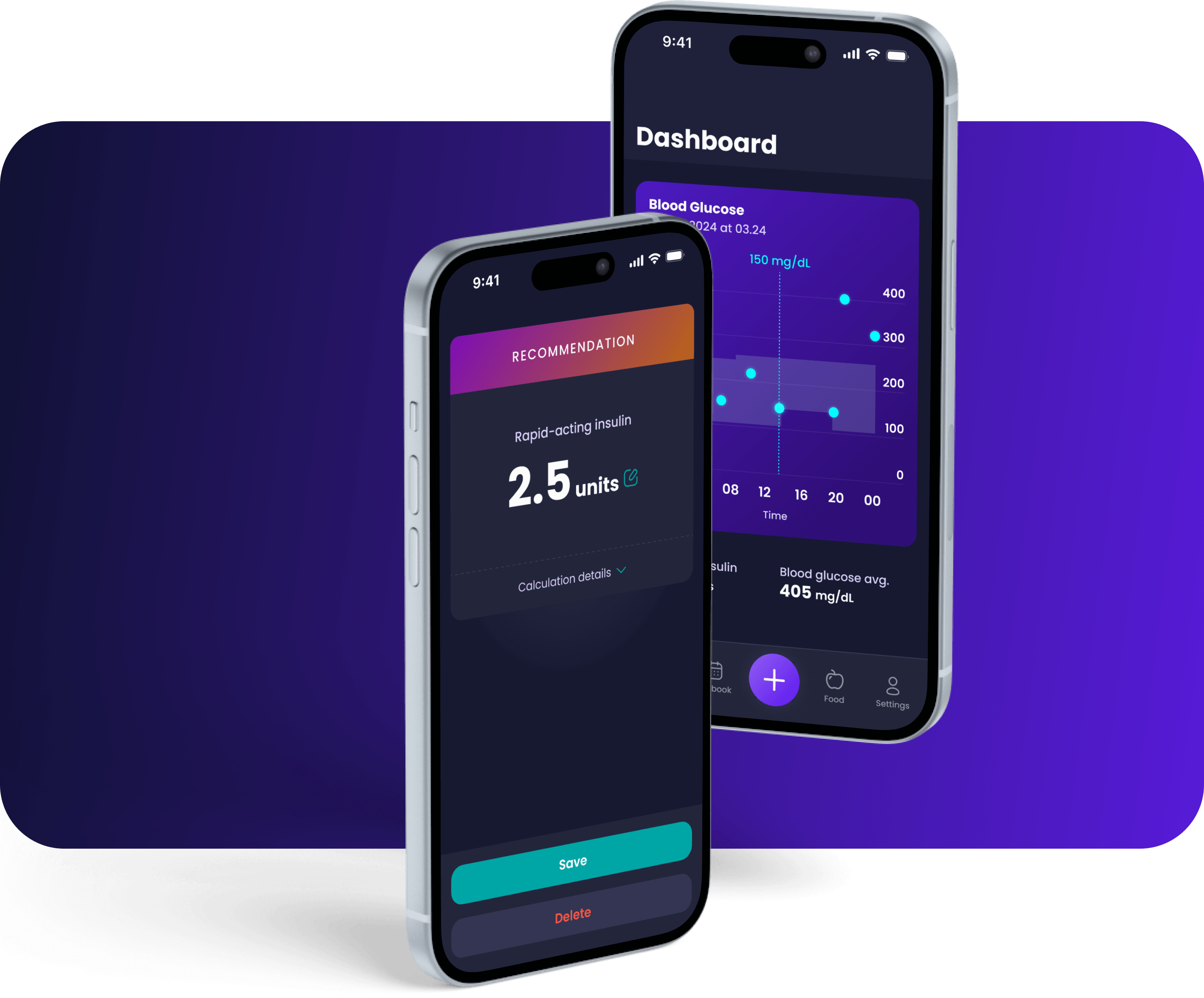
Colourful gradients were added to the app's color scheme to make it feel more approachable and cheerful.

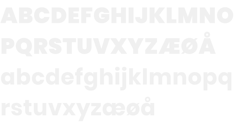
Use of typography
The app originally used a mix of three fonts:
Roboto, Oswald, and Poppins.
To maintain consistency, we streamlined it to just one font – Poppins. But how could we make it feel friendlier? By using bold typography for headings, we achieved a softer and more approachable look.

Rounded corners
The soft touch of rounded corners, adding a gentle and friendly aesthetic to our design language
Key learnings and outcome
- Previously, the app had 224 dialogs and several duplicated sections, which created confusion for users.
Result:
By streamlining the design and reducing the number of dialogs from 224 to 32, the app now requires 13 fewer manual tests and reduces the chances of user errors. - By updating the app's visual design and removing unnecessary flows and functions, it now feels simpler and more intuitive.