Creating roll-ups and e-posters for fair
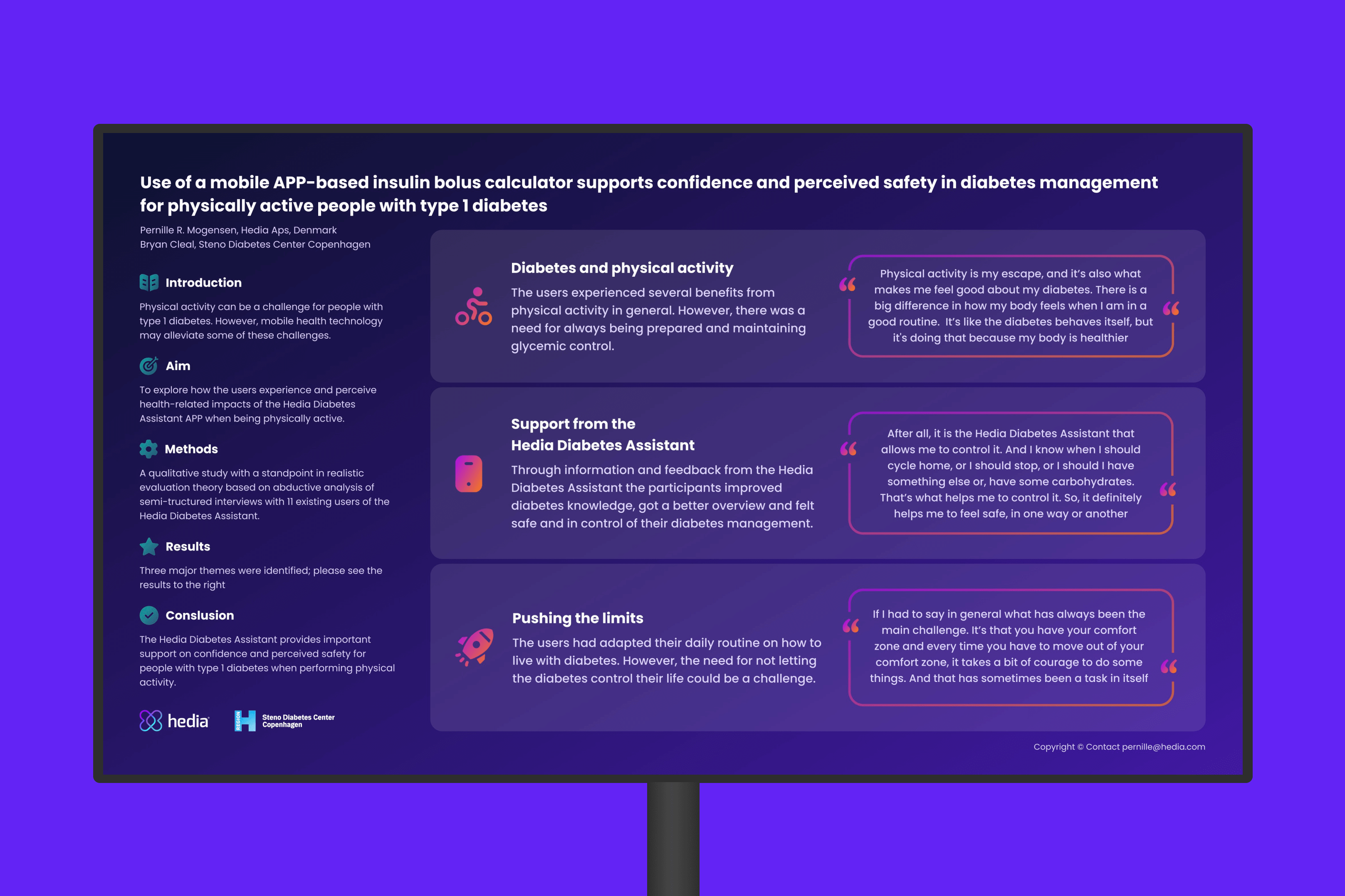
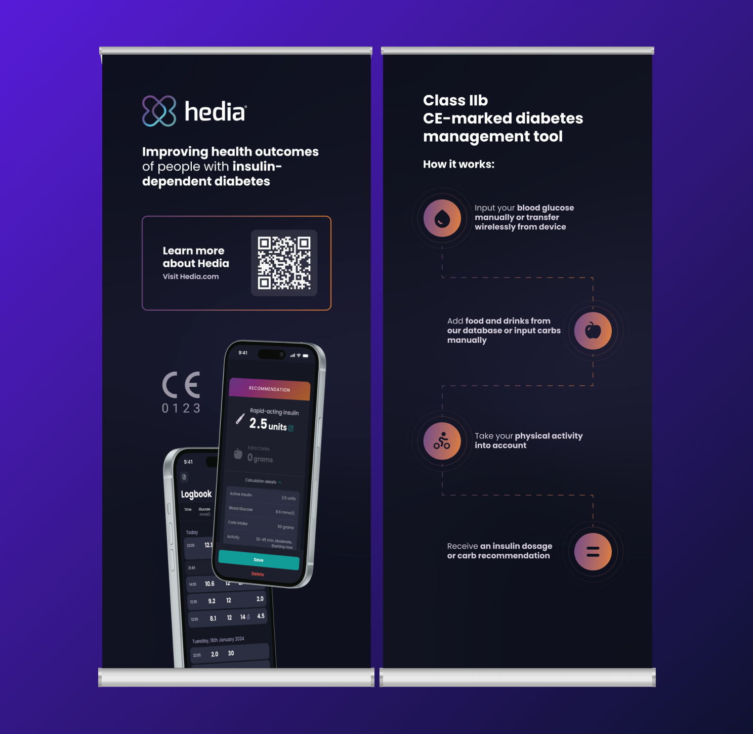
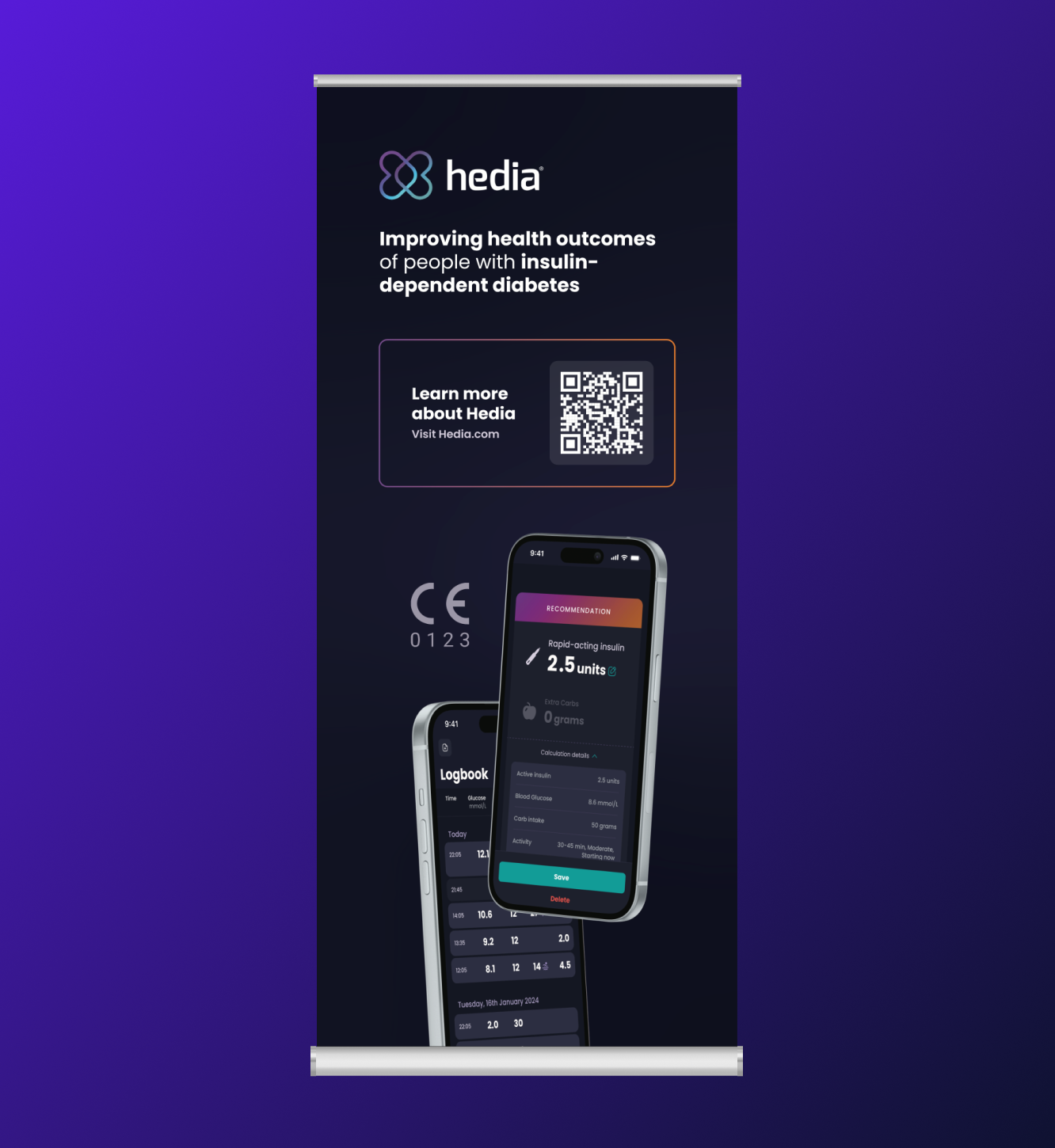
Bring awareness to Hedia and its main product, 'Hedia Diabetes Assistant', by creating wall-panels and an e-poster to showcase studies.
Challenge
Hedia wanted to draw attention to their product while showcasing it at the ATTD fair. The challenge was finding a way to make it stand out among countless other companies, avoid overwhelming visitors with too much information, and present it as a serious and credible solution.
They needed a full booth design that effectively communicated their message while grabbing the attention of passers-by.
Another challenge was creating an e-poster to visually highlight the key points of a study and make it stand out.
Goals

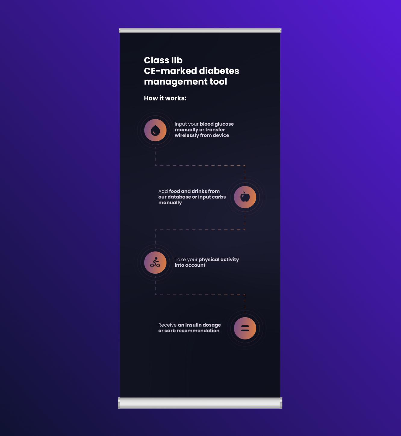
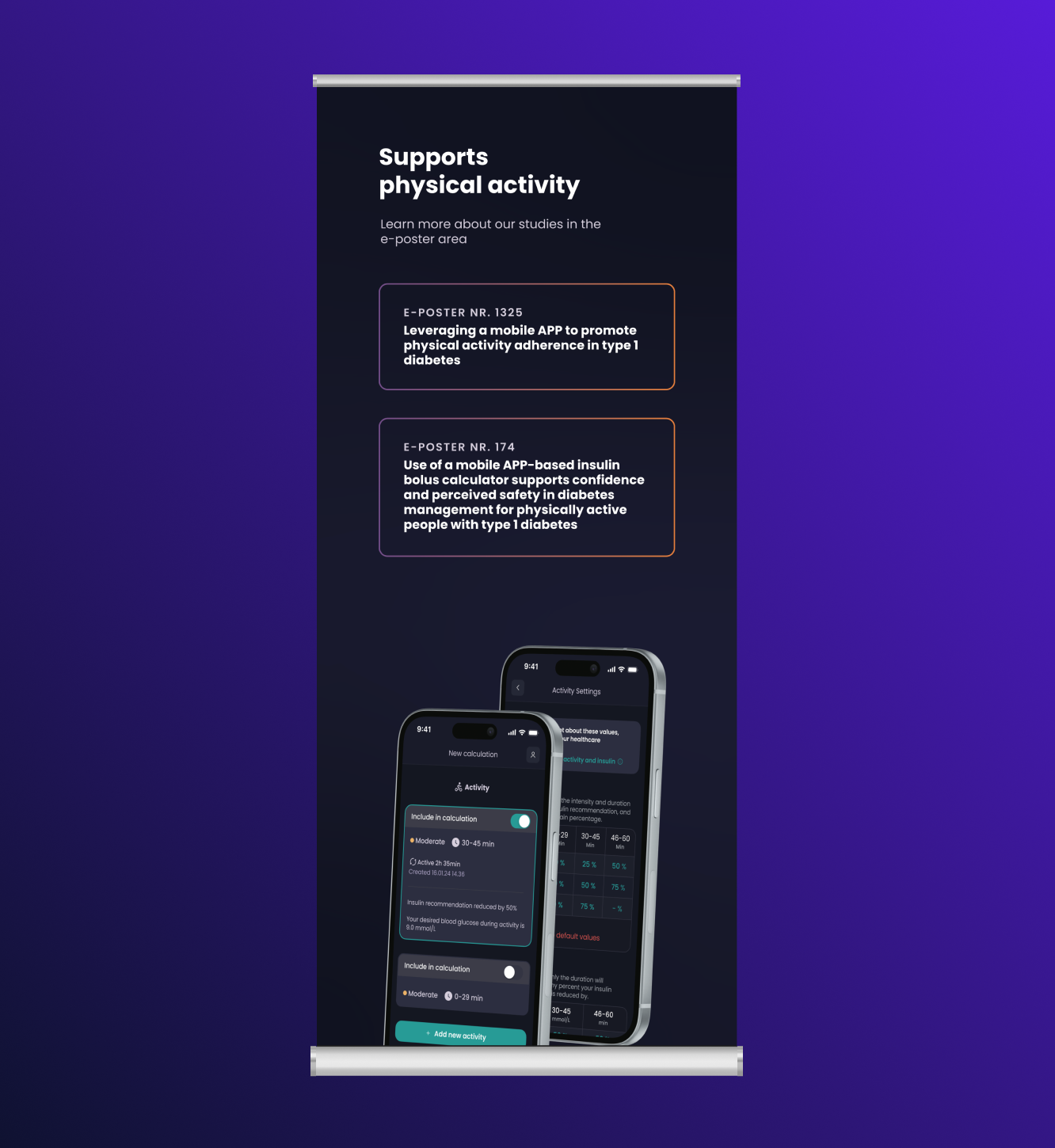
Design attention-grabbing Wall-Panels
Create attention-grabbing and visually clean designs to stand out in a busy fair
Design approachable E-Posters
Create e-posters that are visually approachable, even with a lot of content, by using clear layouts and engaging design elements to make the text easy to digest
My responsibilities
- Collaborate with the medical, commercial, and product teams to determine the content to showcase at the fair
- Design the wall panels, counters, and banners
- Create e-posters in collaboration with the medical team
Design toolkits
Approach when designing wall-panels
- Place the most important points at the top, as the crowd at the fair might block the lower sections.
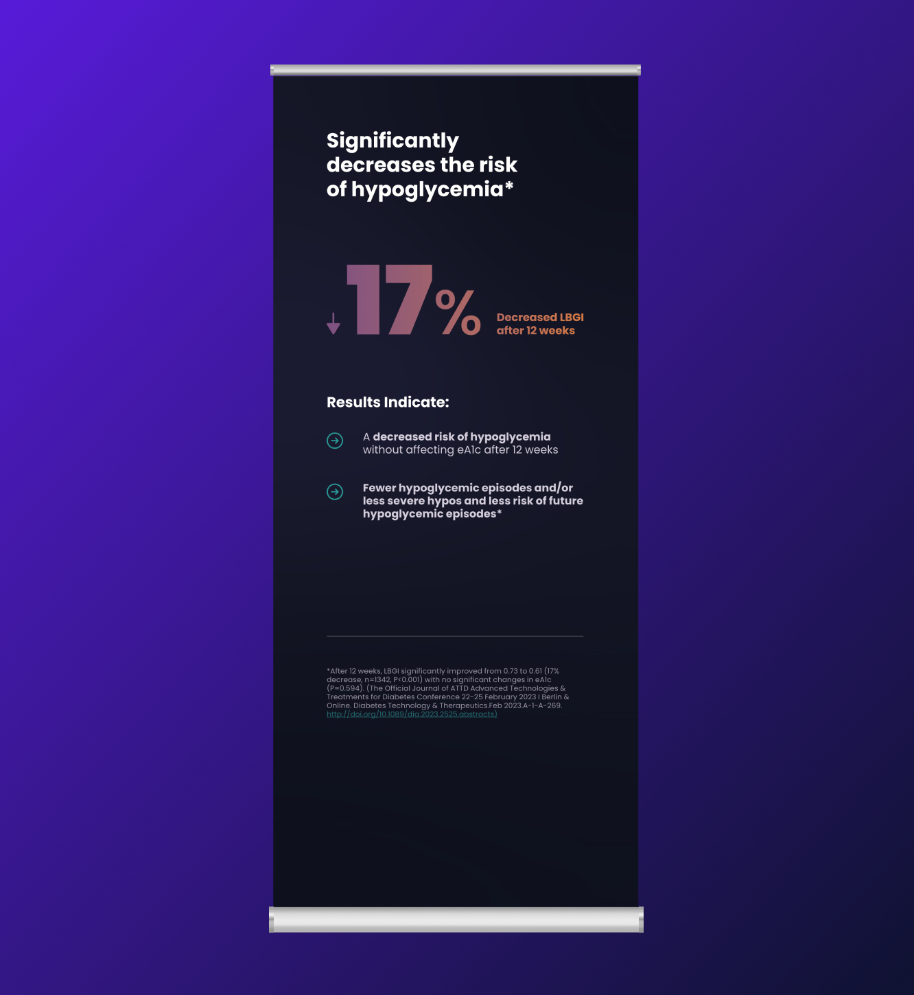
- Make it visually appealing by using bold numbers and strong colours to attract attention.
- Keep the text minimal, as people tend to skim through wall panels rather than read them in detail.
Approach when designing e-posters
- Use icons and headings to create sections and pauses
- Make the most important information stand out by making it larger
- If it's a quote, visually design it as a quote
Key learnings and outcome
Wall-panels:
- Make the key points stand out: Place the most important info at the top, since the crowd might block the lower sections.
- Use bold visuals: Highlight key details with bold numbers and strong colours to grab attention.
- Keep text short: People tend to skim, so keep the text minimal and to the point.
E-poster:
- Create clear sections: Use icons and headings to break up content and give the viewer visual pauses.
